I introduced a modern and fresh look across Ogury’s social media platforms, newsletters, and marketing materials. Implementing bold and vibrant color schemes which grab the user’s attention and sets it apart from competitors. Key elements like neon/gradient color ways, high contrast photography and bold fonts were implemented across all mediums.
Ogury's New Look
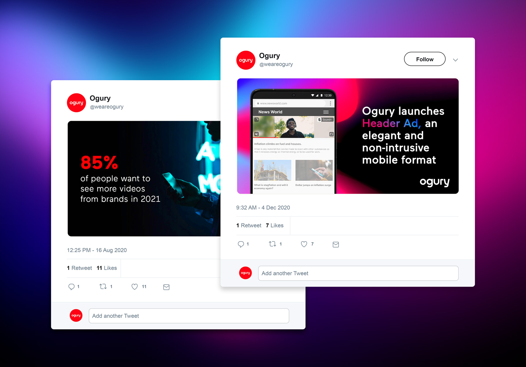
Social Media
Neon and bold
The aesthetic included a new "neon" look. Colors that pop. Even if a user is just scrolling through their feed, they can't help but notice the content. Getting the user's attention is half the battle.
The proof is in the stats
Being a company that centers around data, it made sense to highlight that aspect of the business to its users in a big and bold way.
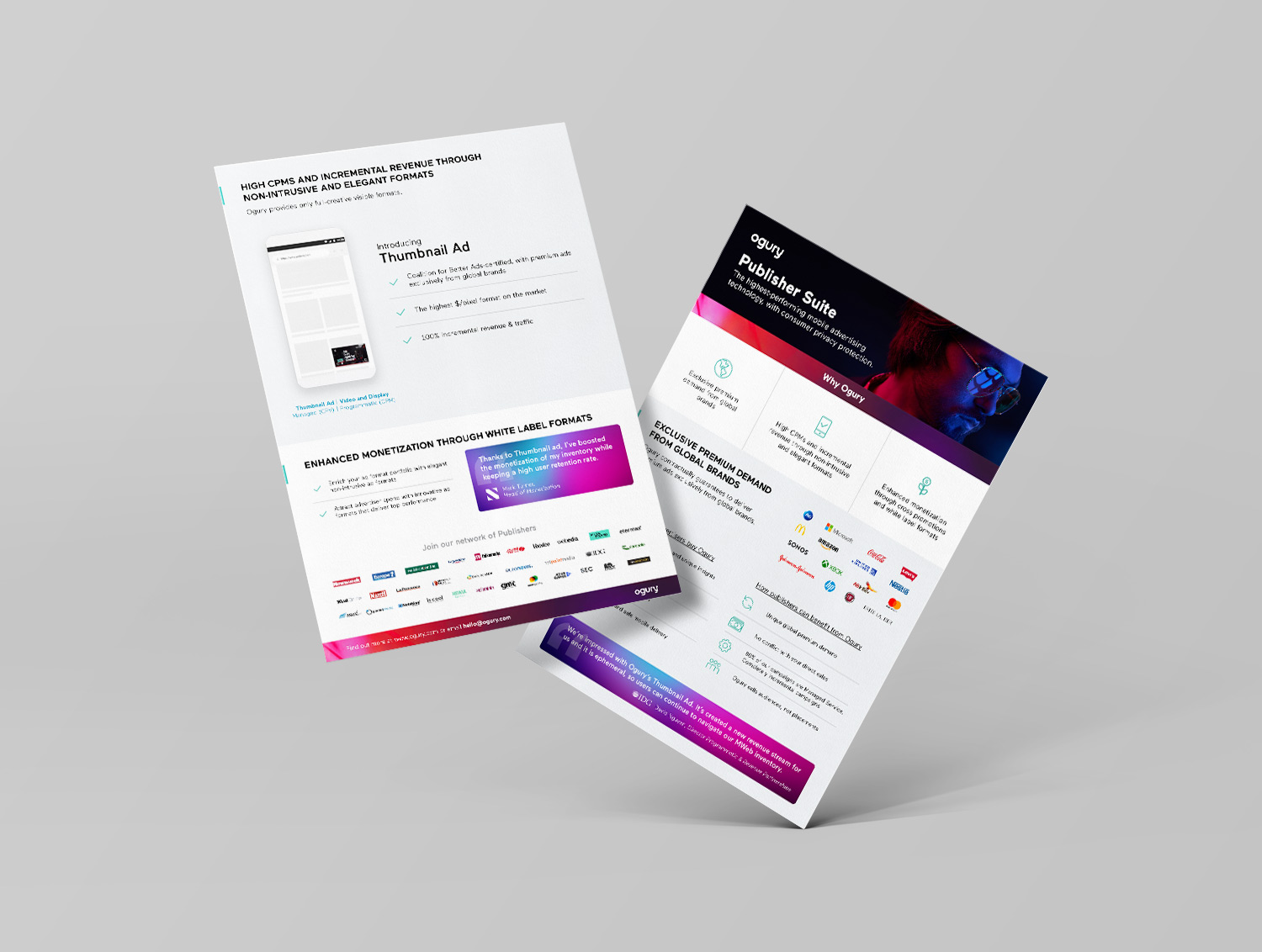
Marketing Collateral
One sheets and other promotional materials were reworked to highlight key content while keeping a consistent and bold look. Client testimonials were implemented using neon-styled design blocks to break up sections of content.
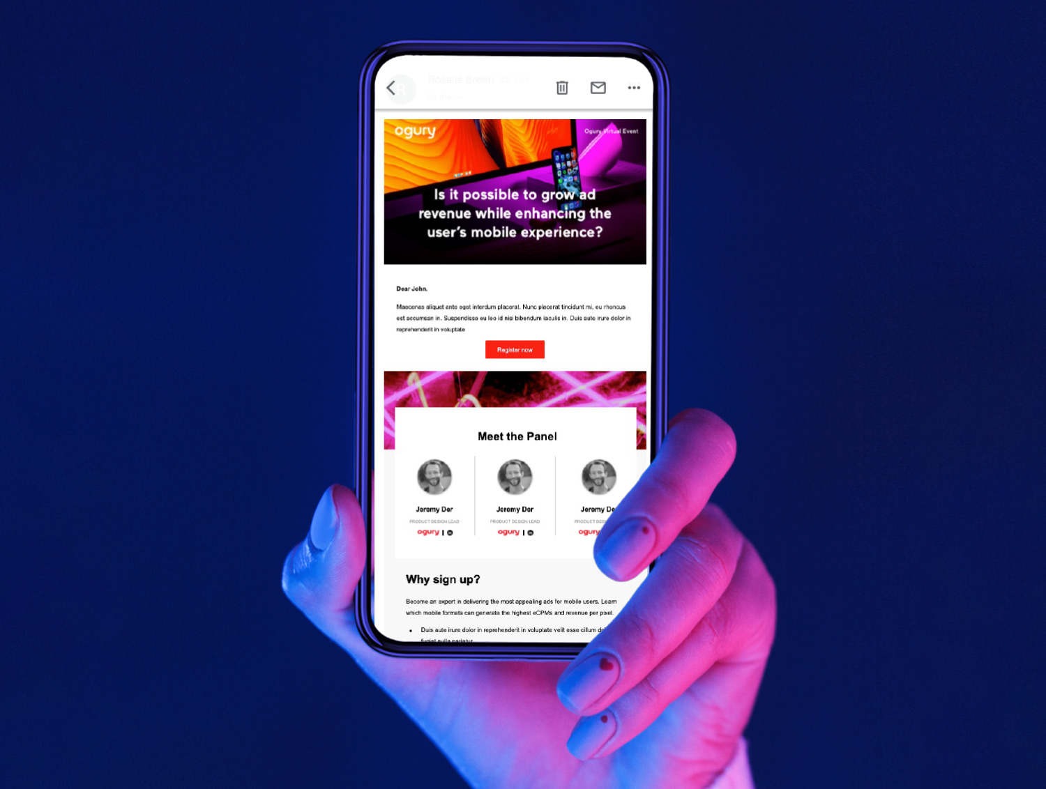
Newsletter
The design was applied to newly created templates. High contrast neon photography, bold fonts and cleaner layout made this revamped email template more successful, having seen a 10% increase in CTR.